Snickle

Snickle

deliverables:

Illustrations

Package Design

Brand Identity

The Challenge

Snickle began as a self-initiated project—our team’s entry point into the world of branding. We wanted to build a fictitious brand that pushed us to think deeper about personality, tone, and storytelling. So we dreamed up Snickle, a pet food brand that doesn’t just fill bowls, but celebrates the wildly expressive lives of the pets who run the show.

Most pet food brands are either overly cutesy or too clinical. But Snickle pets? They’re anything but basic. They’re couch yogis, skateboard champs, kitchen supervisors, and nap connoisseurs. Our challenge was to create a brand that captured their chaos, charm, and charisma—while still grounding it in the seriousness of good nutrition. It had to be fun, but never fluffy.

Value Delivered

Create a visual and verbal world where pets aren’t pets—they’re pirates, rockstars, zen masters, and four-legged food critics. Every illustration, every can, every outdoor ad had to feel like a snapshot from their quirky lives.
Project Description

I worked on the visual identity for ABACA — a brand that creates carefully crafted outdoor furniture and decor. The design is inspired by nature and keeps things warm and inviting, using soft tones and hand-drawn illustrations to match ABACA’s calm and thoughtful style.

The Challenge

When ABACA approached us, they were looking for a visual identity that felt warm, natural, and timeless—something that showed their elegant yet down-to-earth personality.

The challenge was to create a look that felt different from the usual luxury style, which often feels very polished and minimal. ABACA wanted something more welcoming and human, while still looking high-quality.

Approach

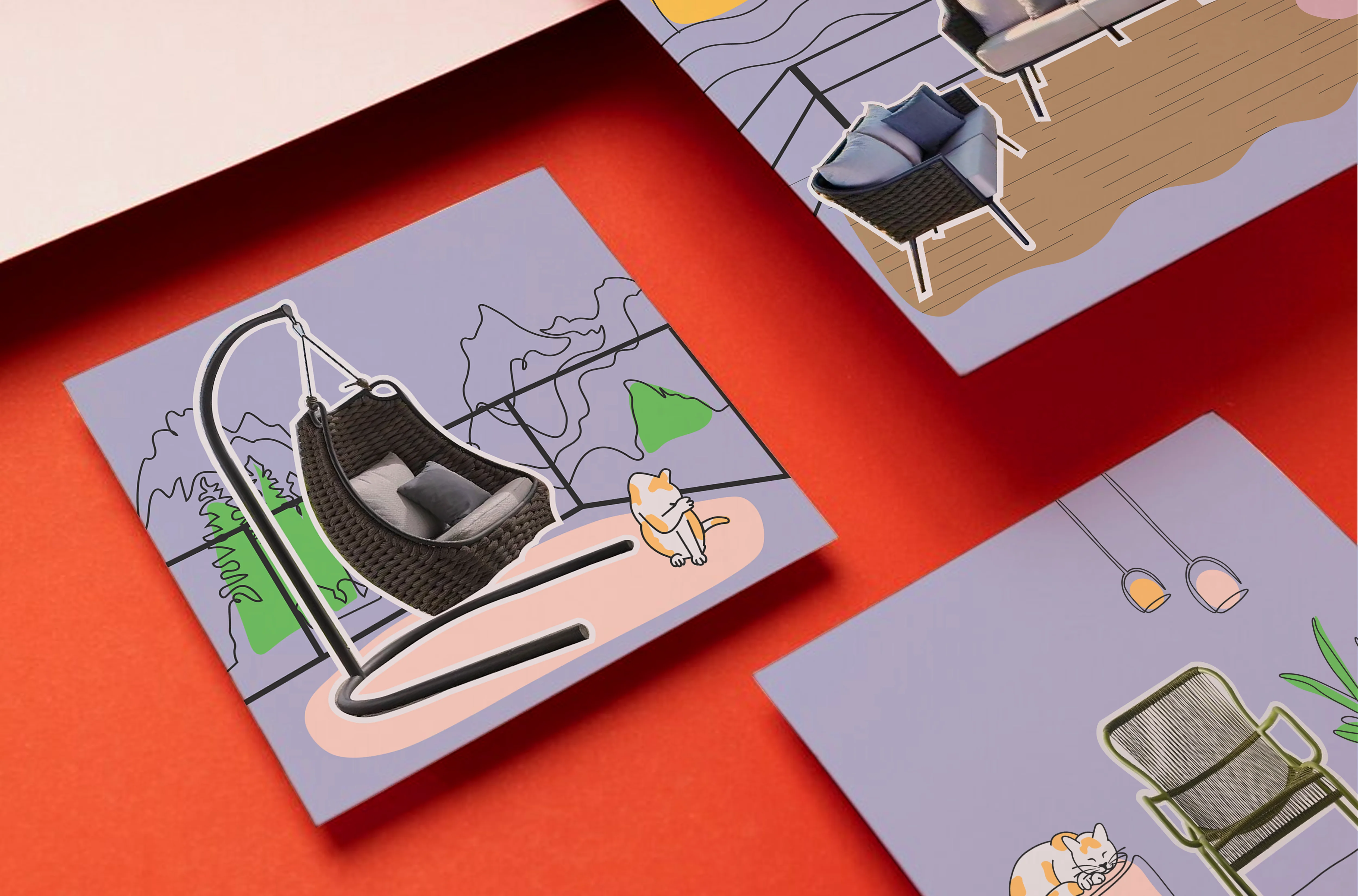
To bring ABACA’s identity to life, we used hand-drawn illustrations and textured collage elements. Instead of clean digital graphics, we went for a pencil-style look that felt more real and warm. A key part of the visual language was the use of one-liner illustrations—simple yet expressive drawings that added a personal, handcrafted touch. The soft, earthy colour palette was inspired by nature and matched the materials and feeling of ABACA’s outdoor collections.

We learnt about their background and what inspires them. We explored lots of ideas—sketching, trying out layouts, illustration styles playing with colors—until everything came together in a way that felt just right. After a lot of back and forth, we found the right balance—something that felt both elegant and easygoing.

Illustrations

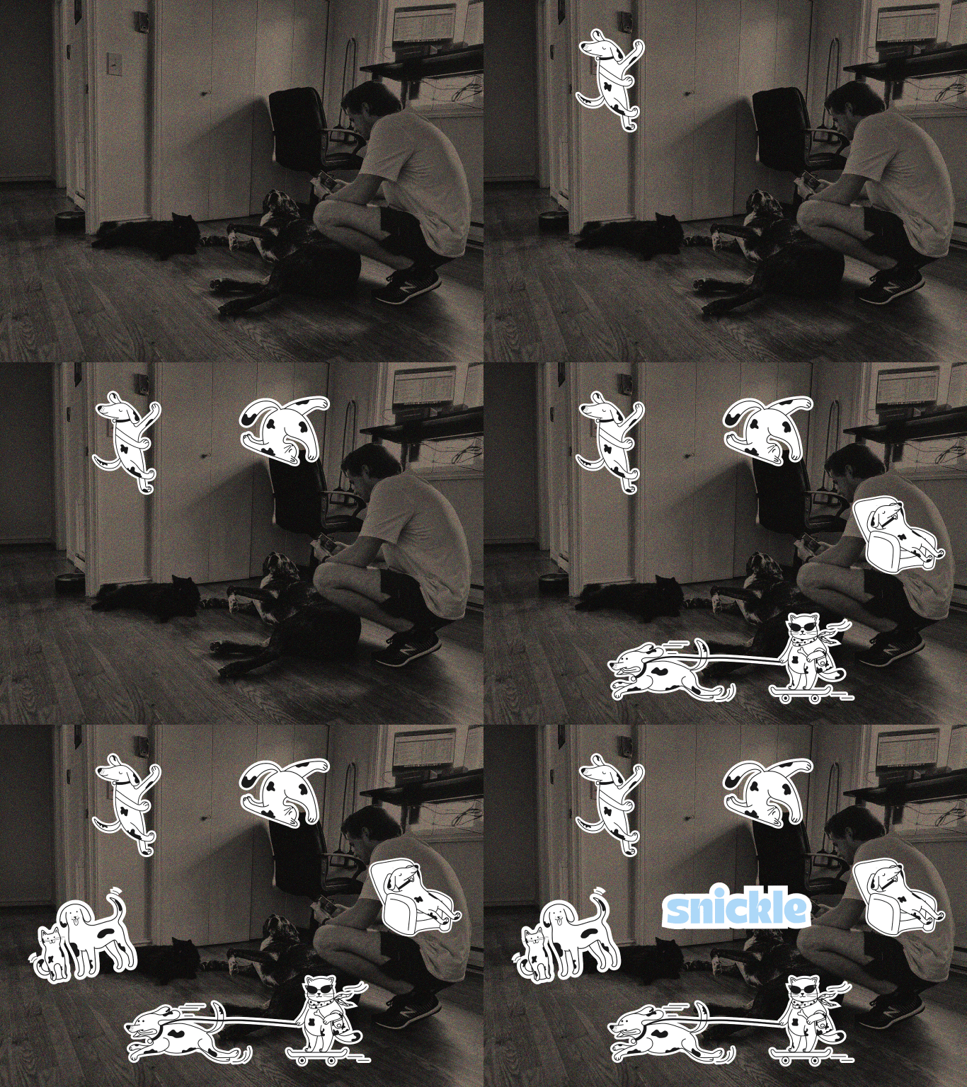
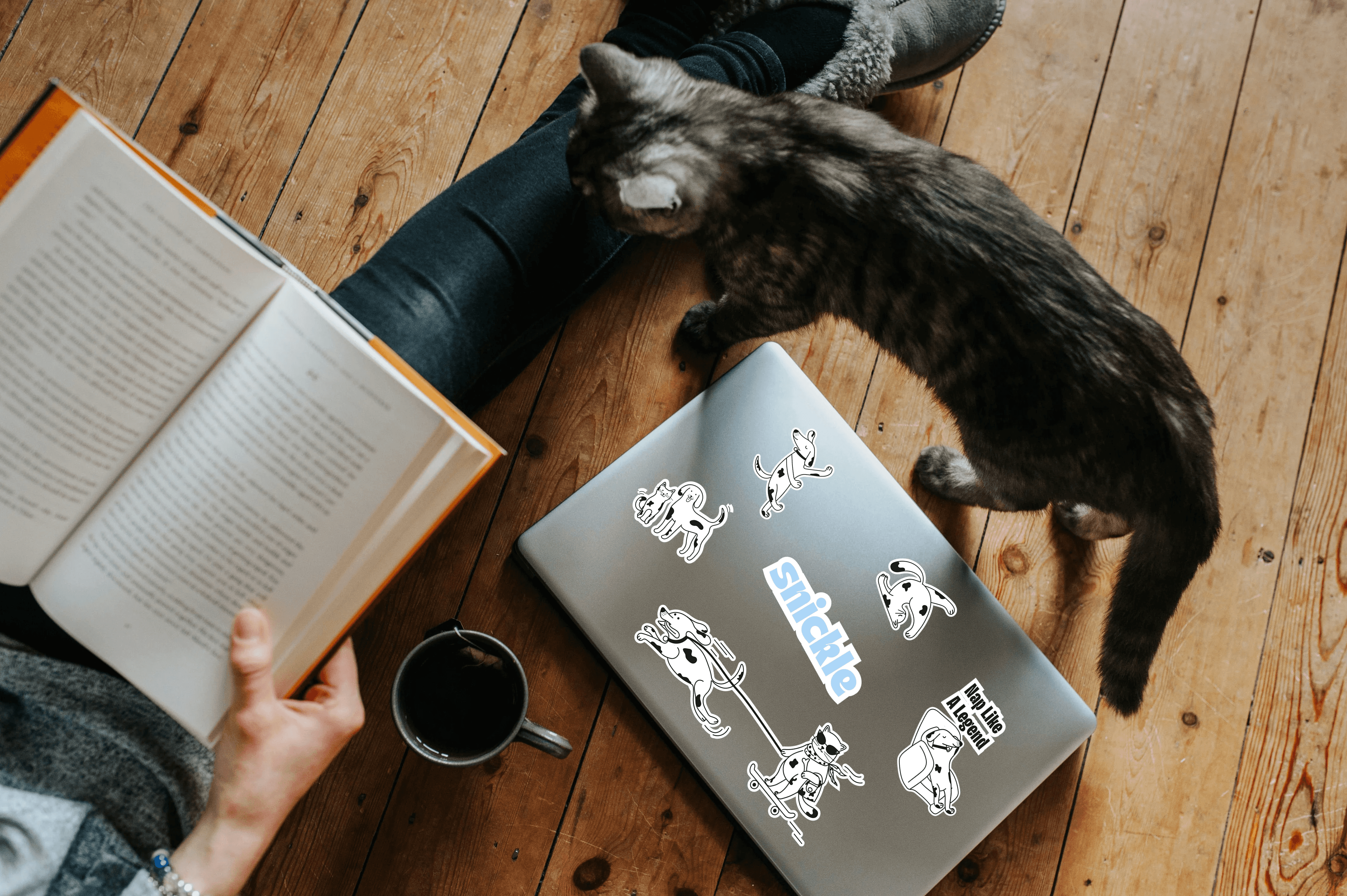
We drew up a gang of irreverent, high-energy pets illustrated in bold, black-and-white linework. Their antics? Legendary. From a cat being pulled on a longboard by a dog to a pup meditating mid-‘om’, each design added charm and chaos in equal measure. The style was playful, punky, and confident—a true break from the category's usual tropes.

Packaging

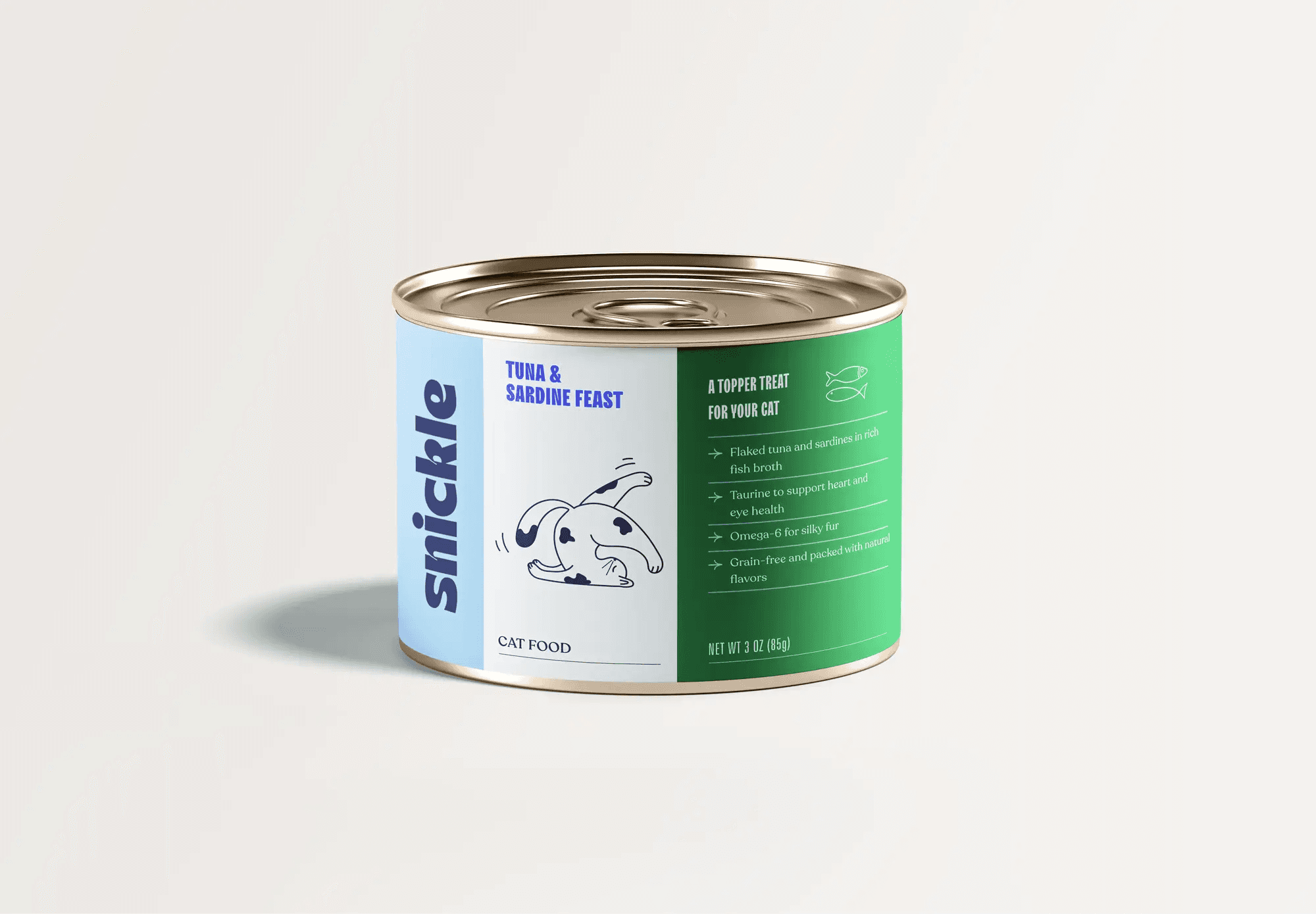
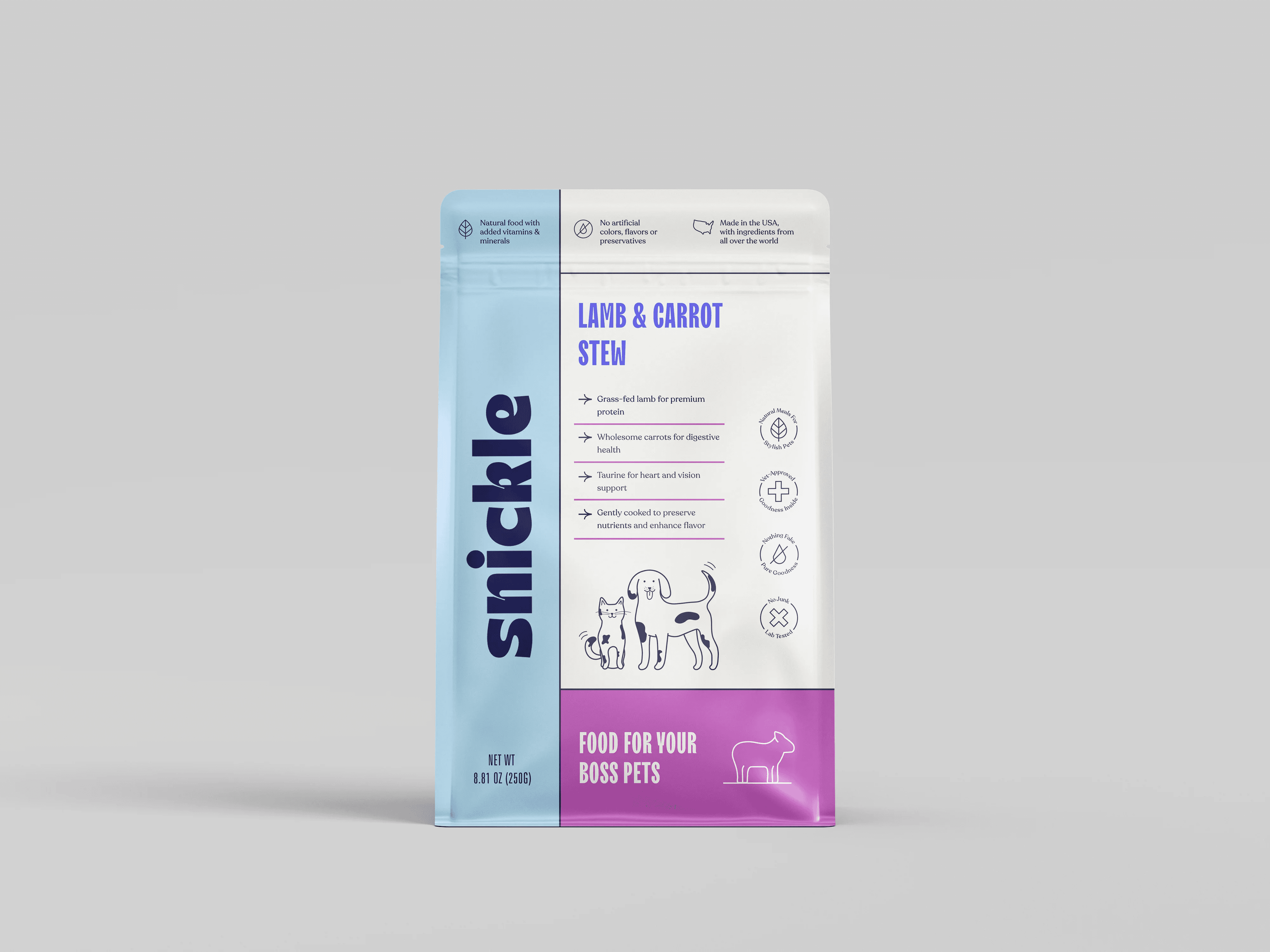
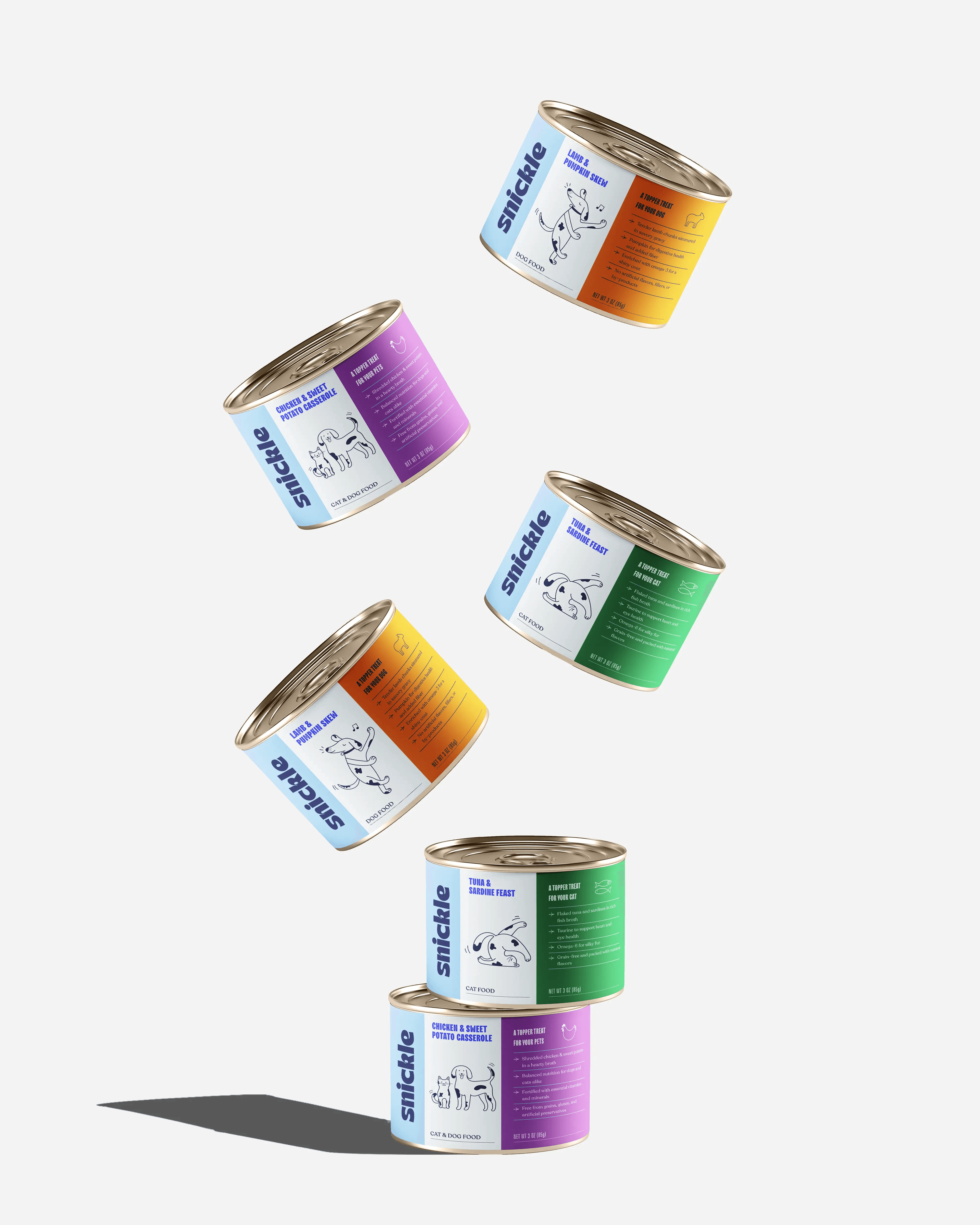
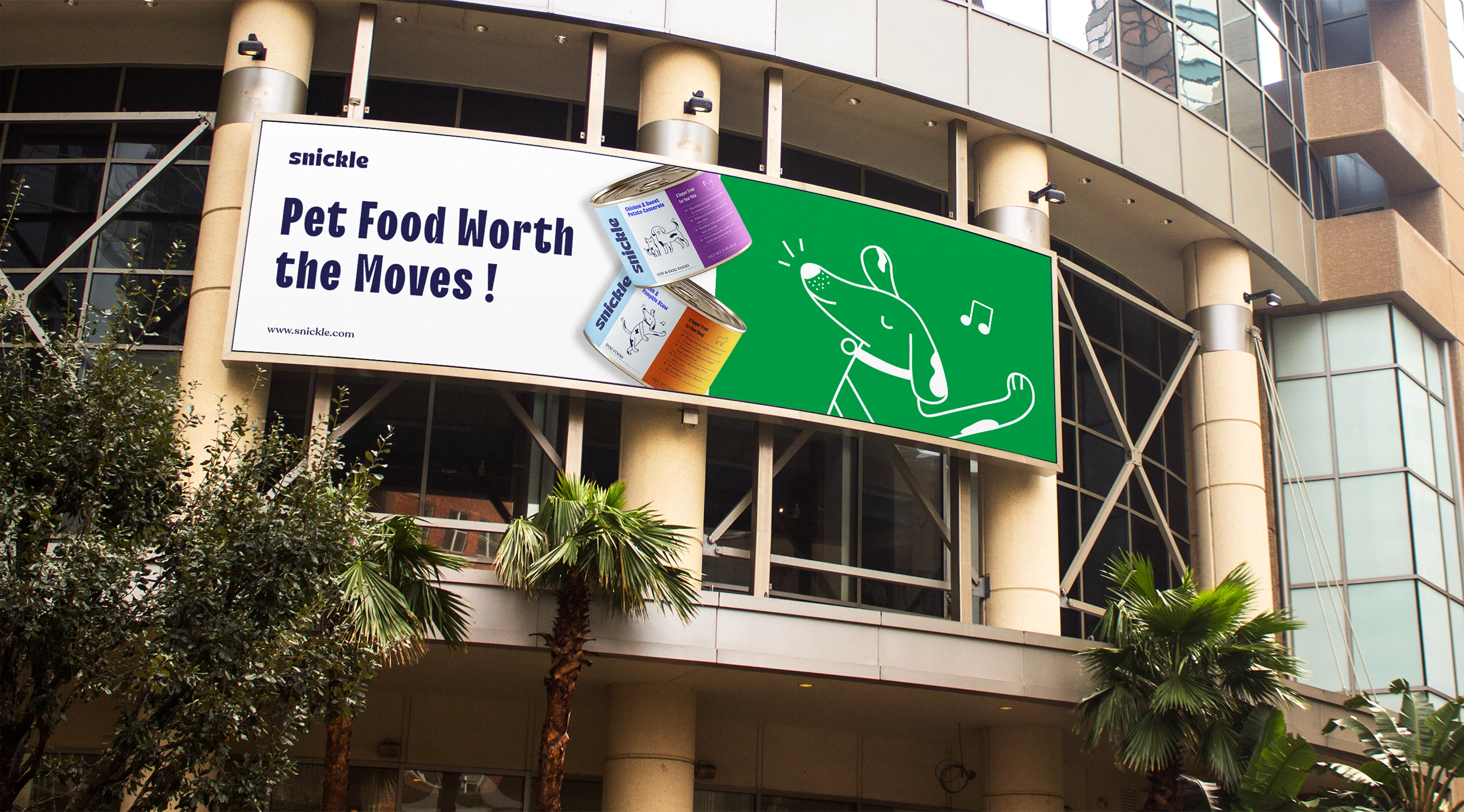
The cans became the stage for each pet’s personality. Pastel color blocks differentiated flavors while keeping a sense of lightness. A dog doing the worm? That’s “Pet Food Worth the Moves.” A sleepy pup draped on a sofa? “Nap Like a Legend.” The packaging communicated attitude at a glance and care with every word.

Outcome

The final design feels warm, friendly, and welcoming—like an open invitation to enjoy life outdoors and appreciate handmade things. It tells a quiet story about slowing down, noticing beauty in simple details, and feeling at ease.

This matched perfectly with ABACA’s values and connected well with people who care about thoughtful design and comfort.

OOH & Merch

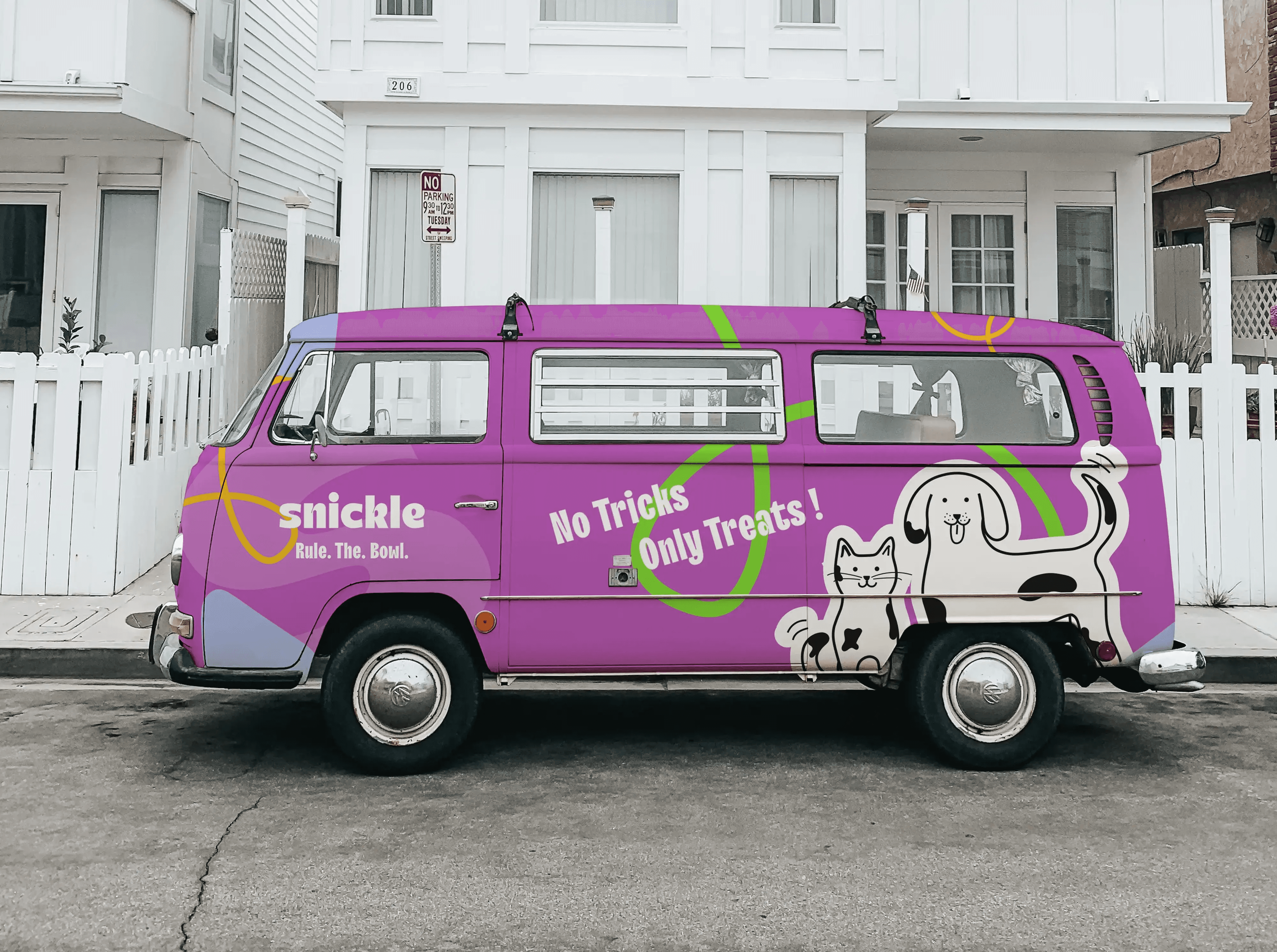
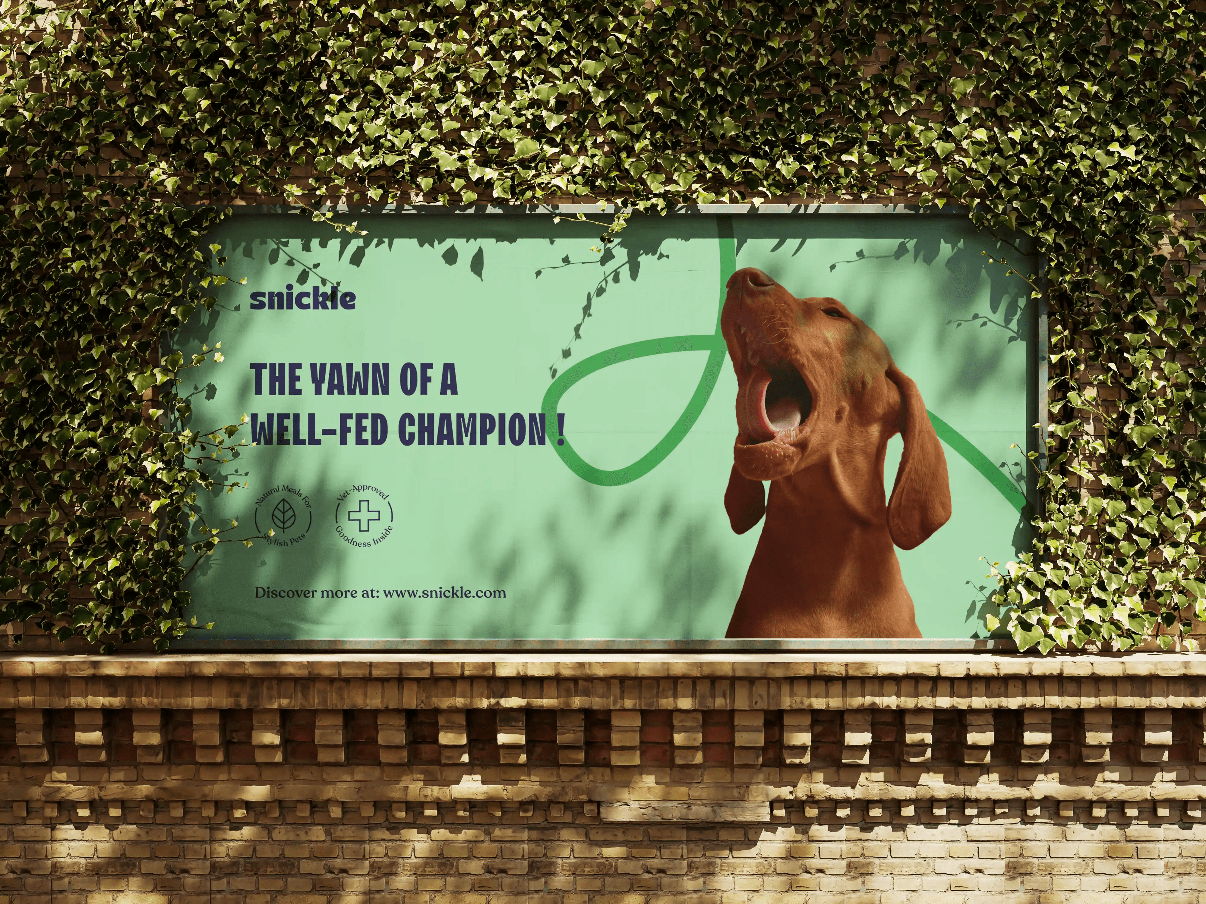
OOH ads and merch weren’t just marketing—they were declarations. “Om nom nom is our mantra” turned a meal into a moment of zen. “Not for the basic pets” told the world your pet was a main character. “Fashionably fed, always ahead” celebrated that every meal was haute cuisine. The t-shirts, stickers, and digital assets became ways for owners to wear their pet pride—and for pets to own the room even before walking in.

Tone

ABACA’s tone is warm, calm, and inviting. It feels thoughtful and grounded—like having a quiet conversation with someone who truly values nature, design, and comfort. The brand doesn’t try to be loud or overly polished. Instead, it speaks in a soft and honest way, reflecting a slower, more mindful lifestyle. It celebrates the beauty of handmade work, the feeling of being outdoors, and the joy of simple, well-made things.

The tone is personal and friendly, yet still refined—making people feel welcomed, relaxed, and inspired by the natural world.

Verbal Identity

The tone was cheeky, warm, and just a little irreverent. Phrases like “All meat, no bark”, “No tricks, only treats”, and “Yawn of a well-fed champion” walked the line between humor and hunger. Even the ingredient stories weren’t spared from personality. Each recipe’s origin story read like a chef’s tale—from farmer’s field to fancy feast.

The Result

Snickle isn’t just food—it’s a vibe. It doesn’t cater to pets. It champions them. In a world where kibble is often just… kibble, Snickle created a world where every bowl is a badge of honor and every mealtime is a moment.

Create a free website with Framer, the website builder loved by startups, designers and agencies.